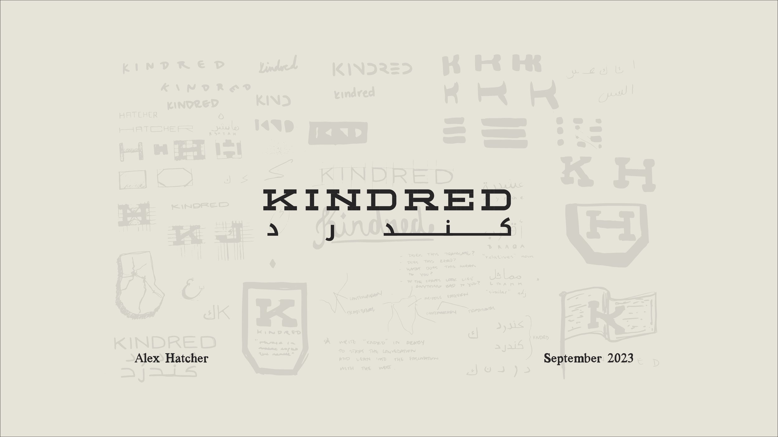
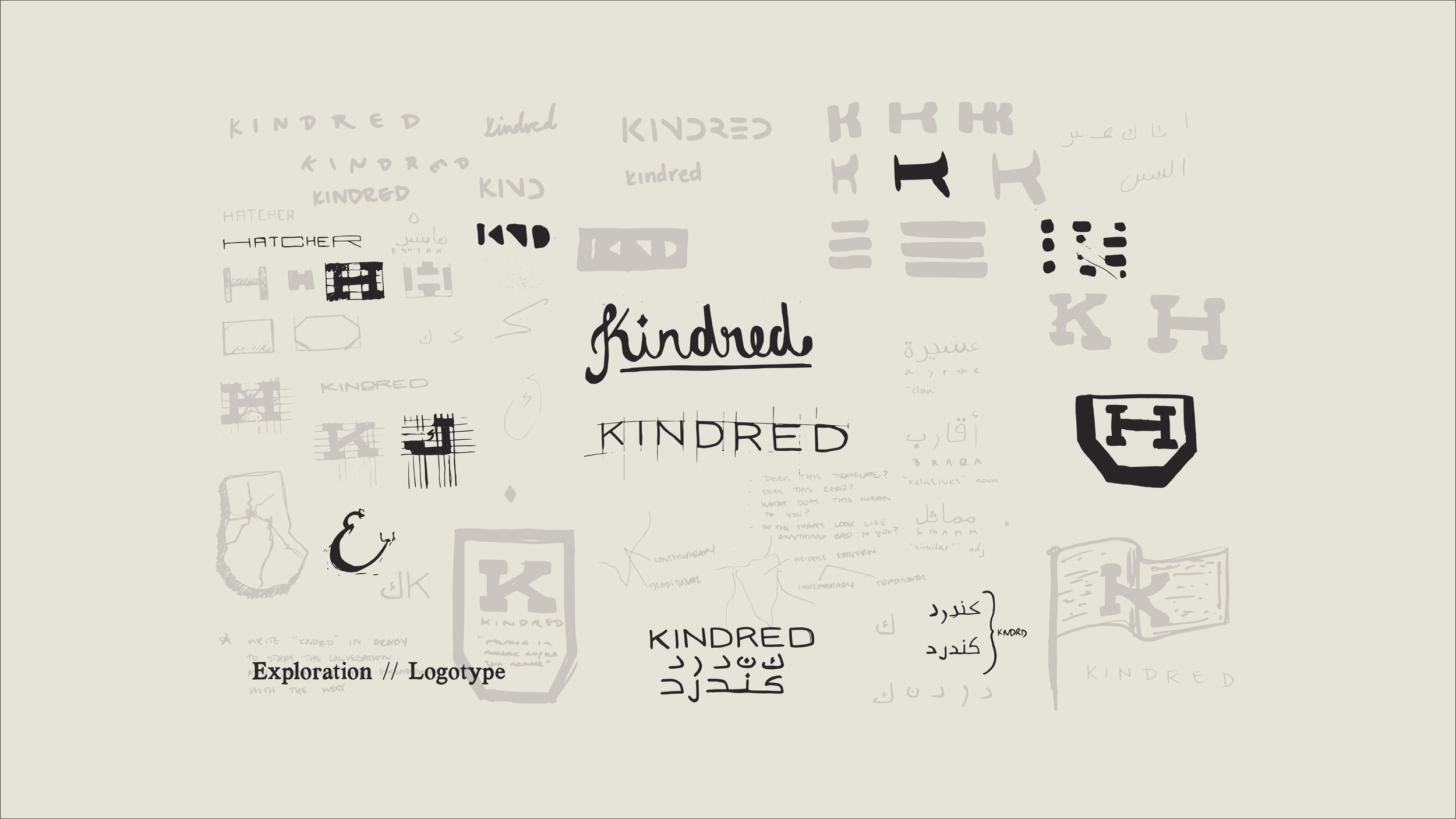
KINDRED //
KINDRED //
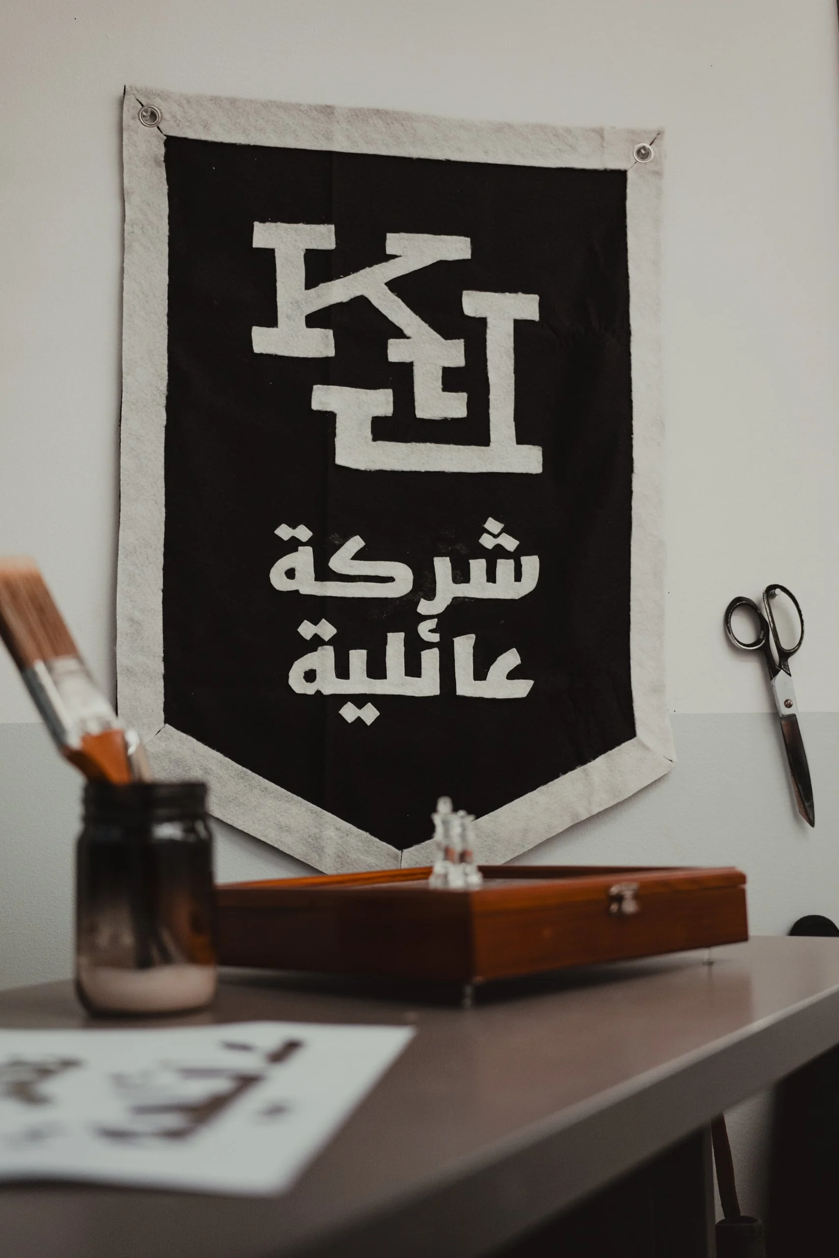
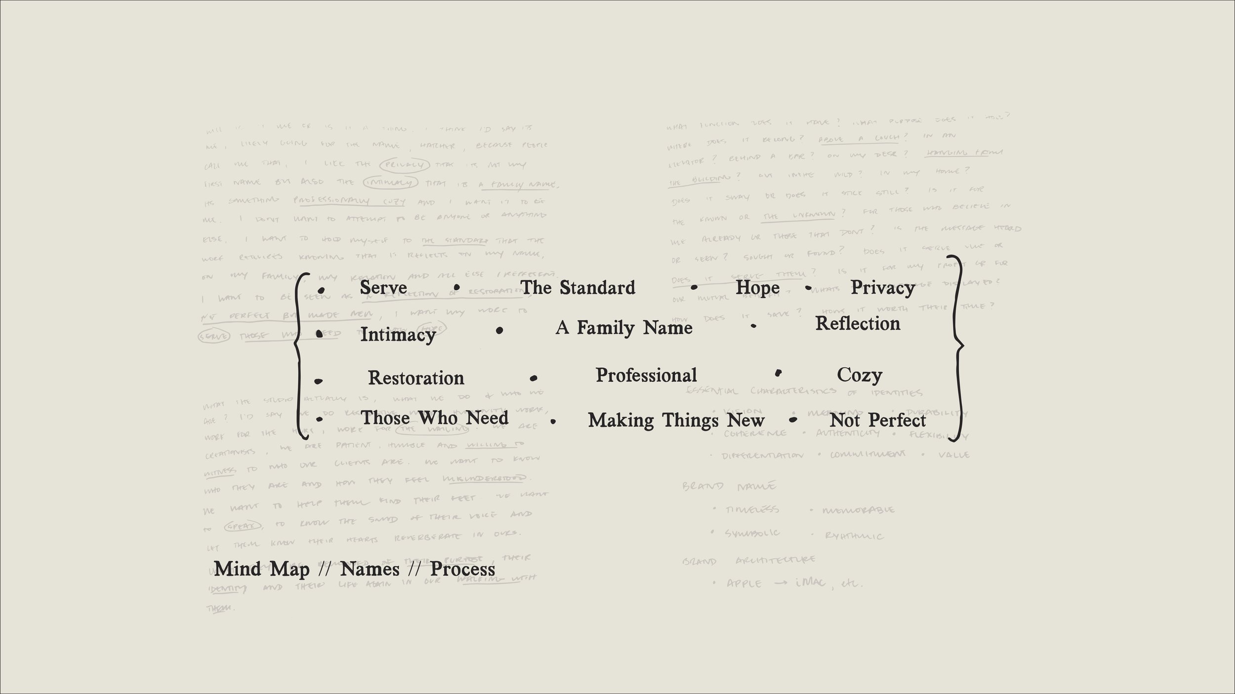
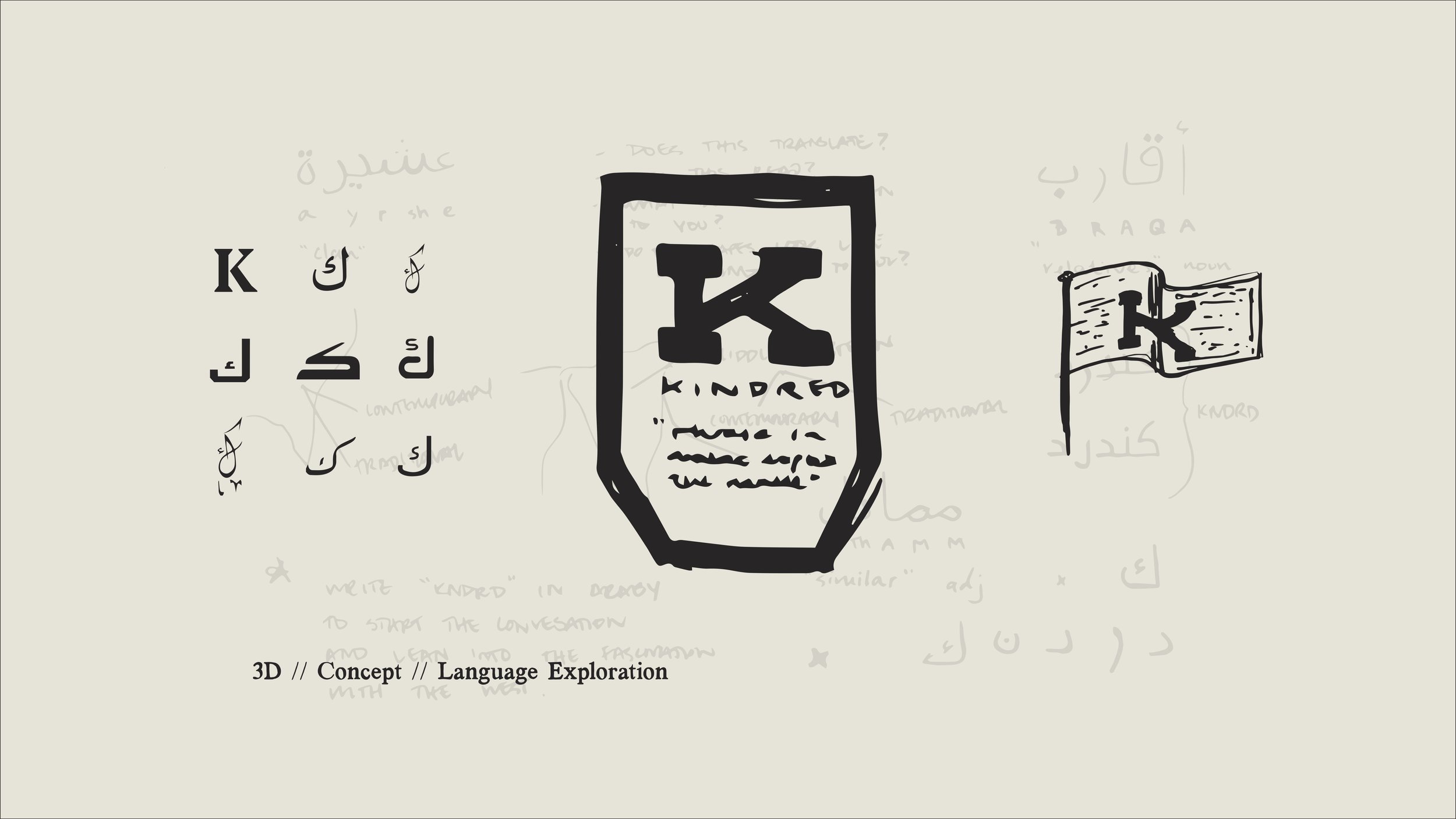
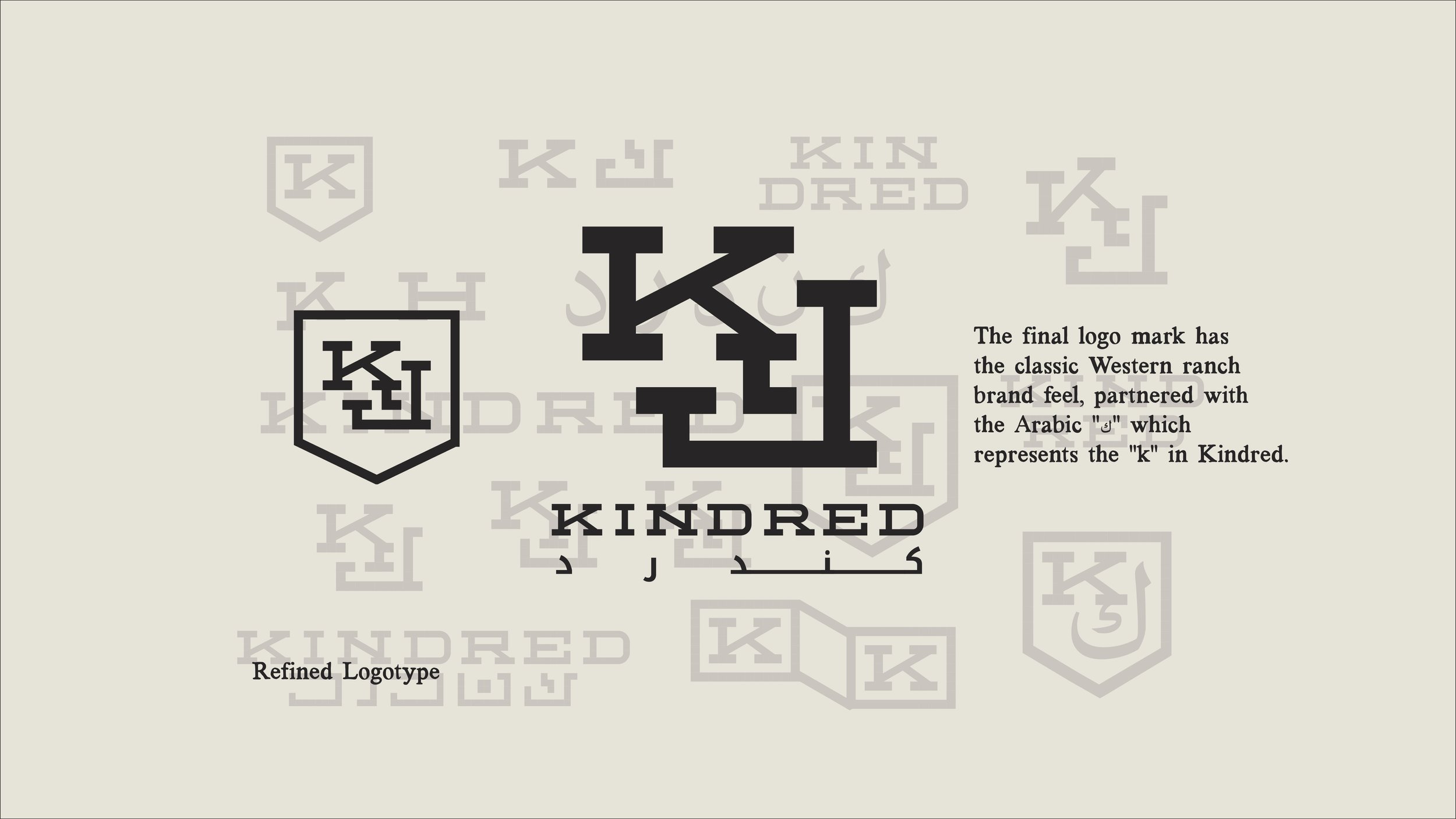
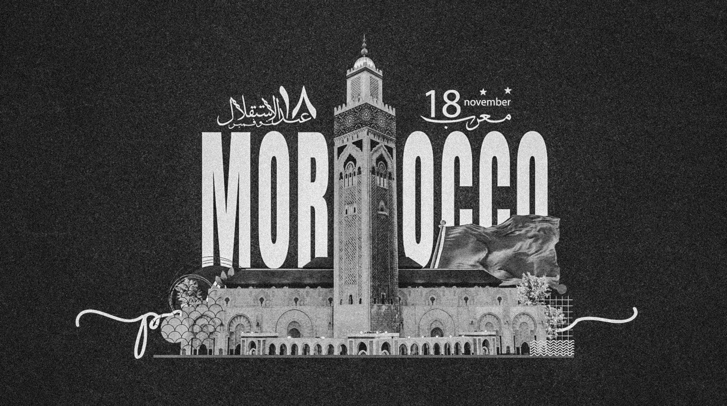
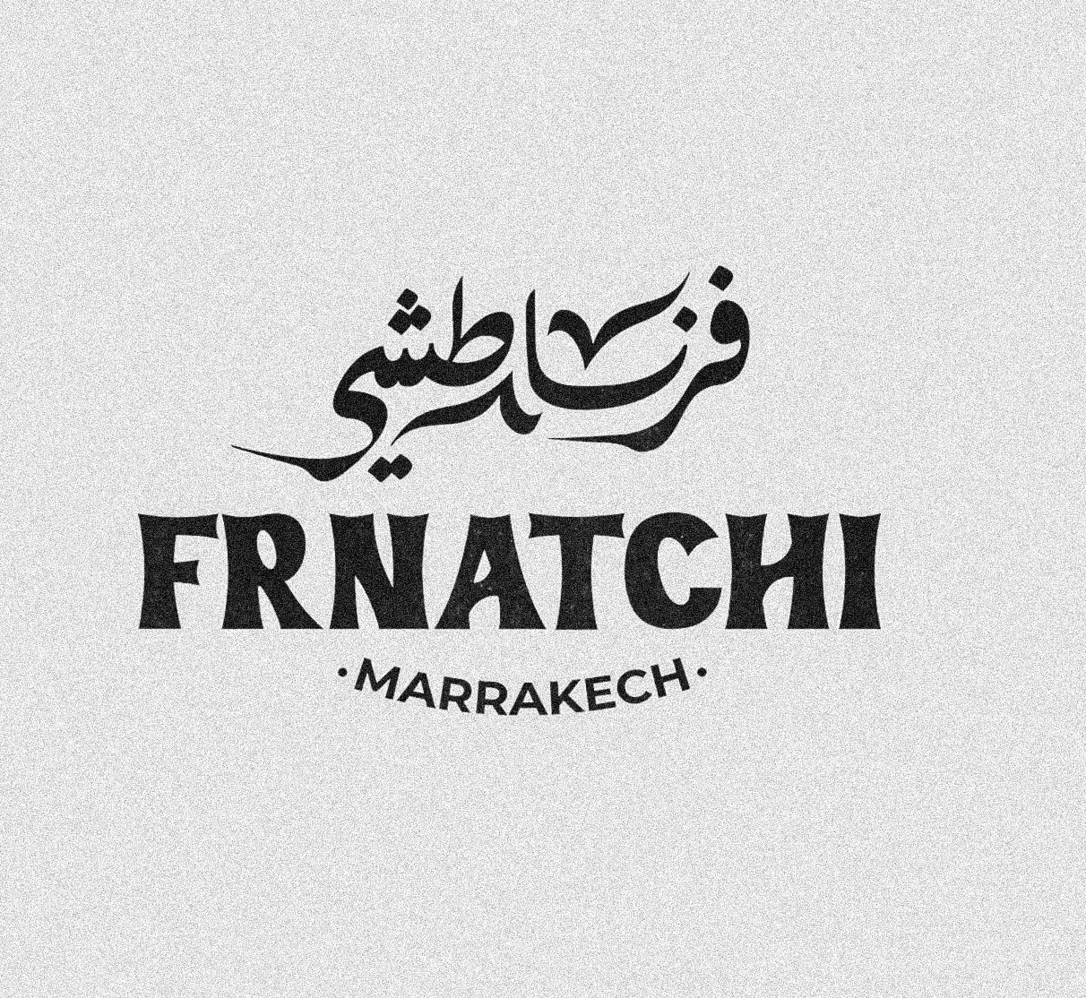
Tasked to rebrand a creative studio in the heart of morocco and to display this brand through a shop sign, i got to work studying the ins and outs of the arabic language. learning the alphabet in its entirety, and studying arabic typography to understand the edge of legibility, as well as a deep dive into arab and moroccan culture gave me much confidence to continue on in developing a sturdy and sustainable family brand that would drive business and company culture for years to come.
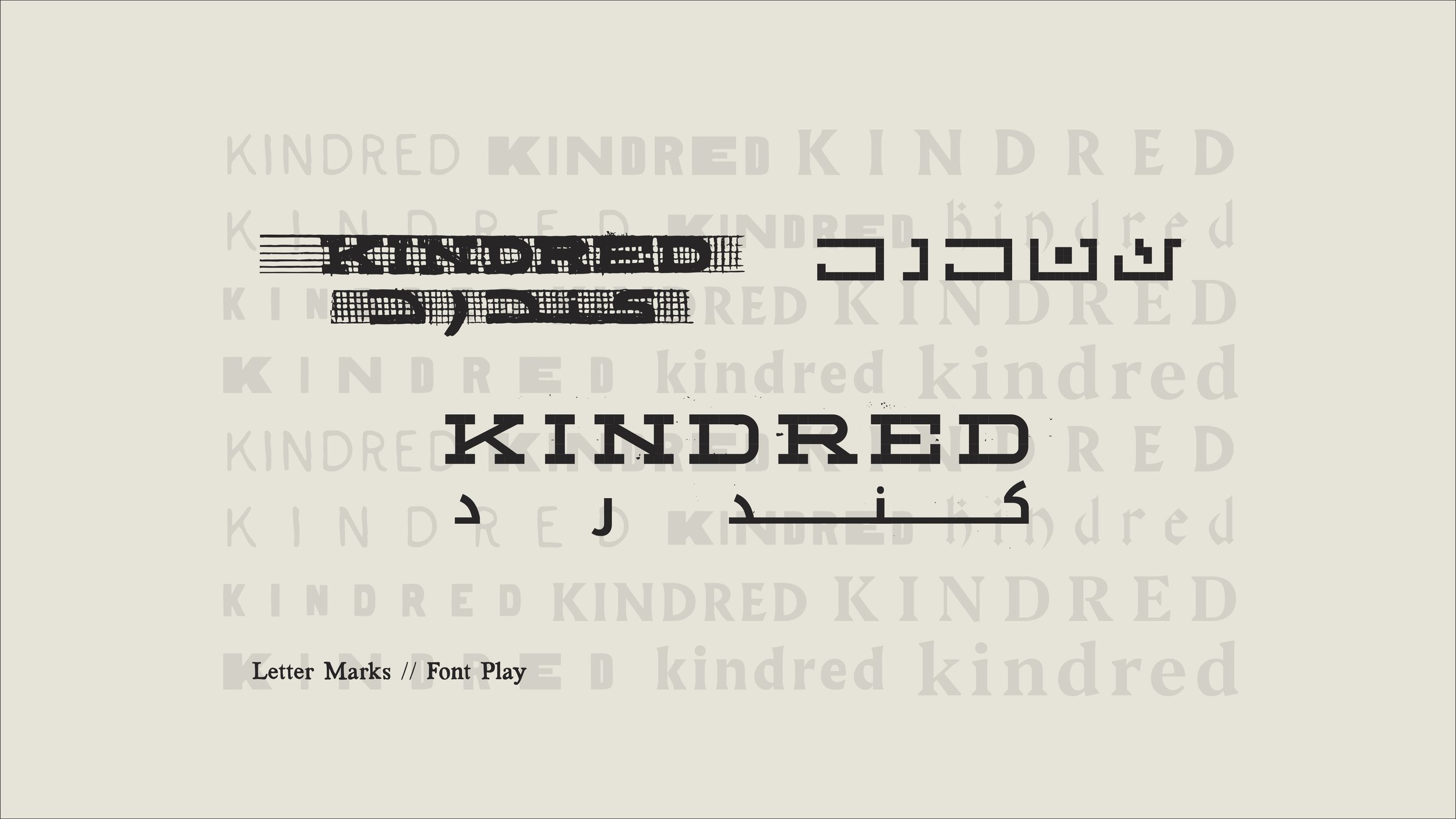
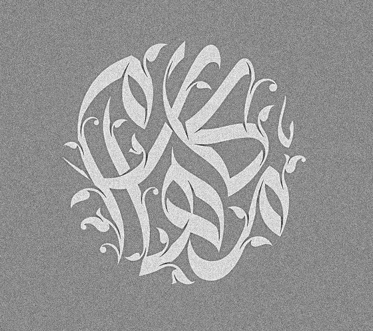
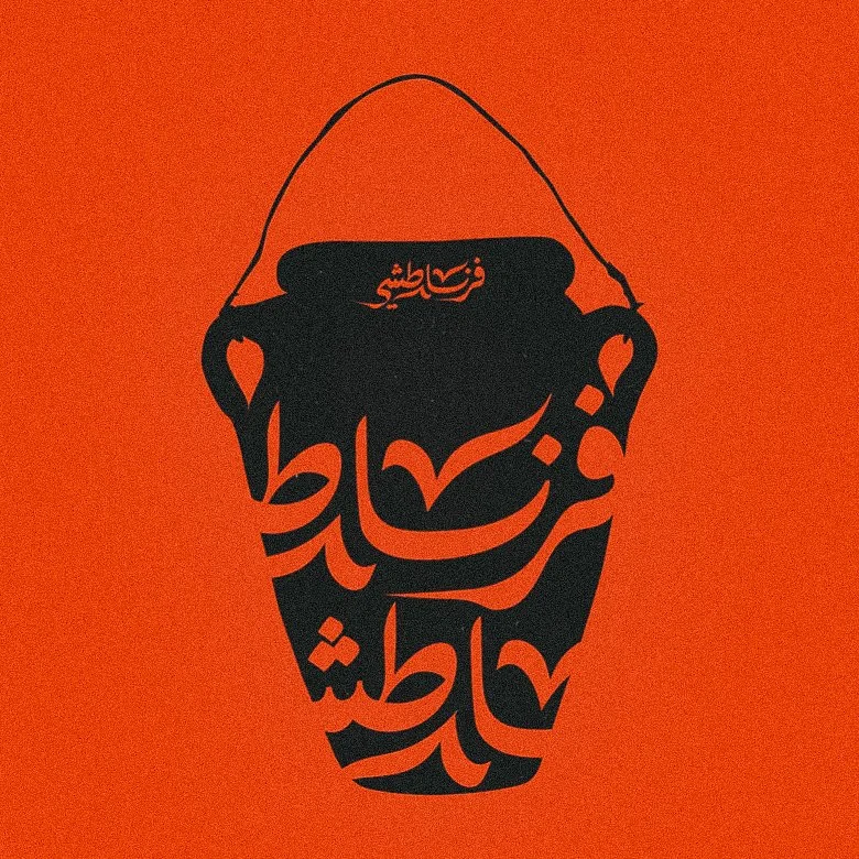
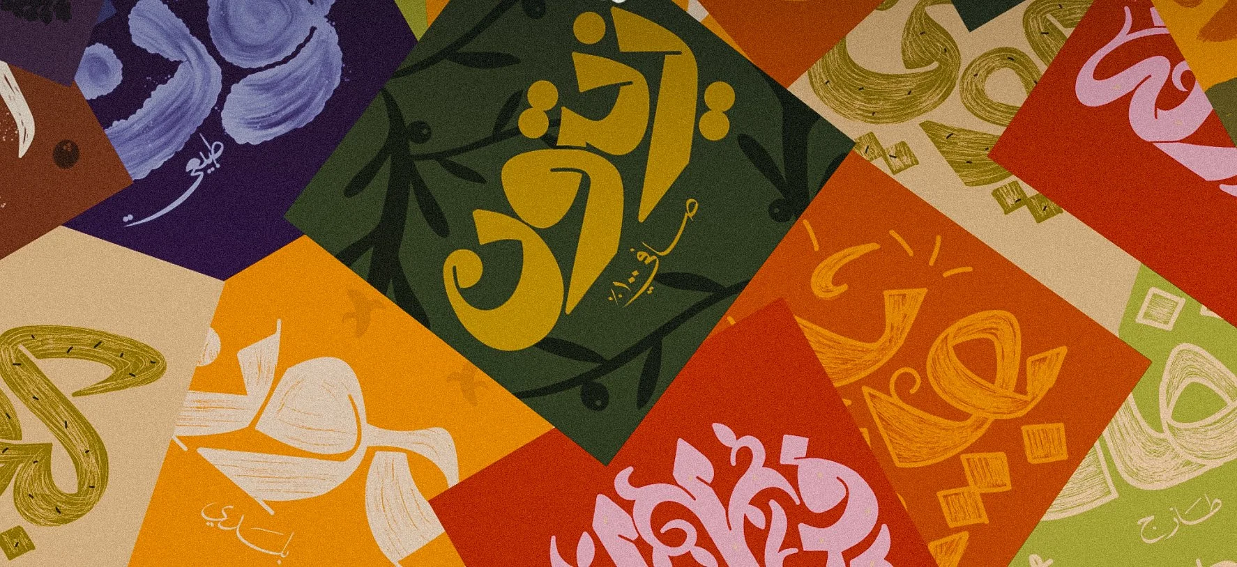
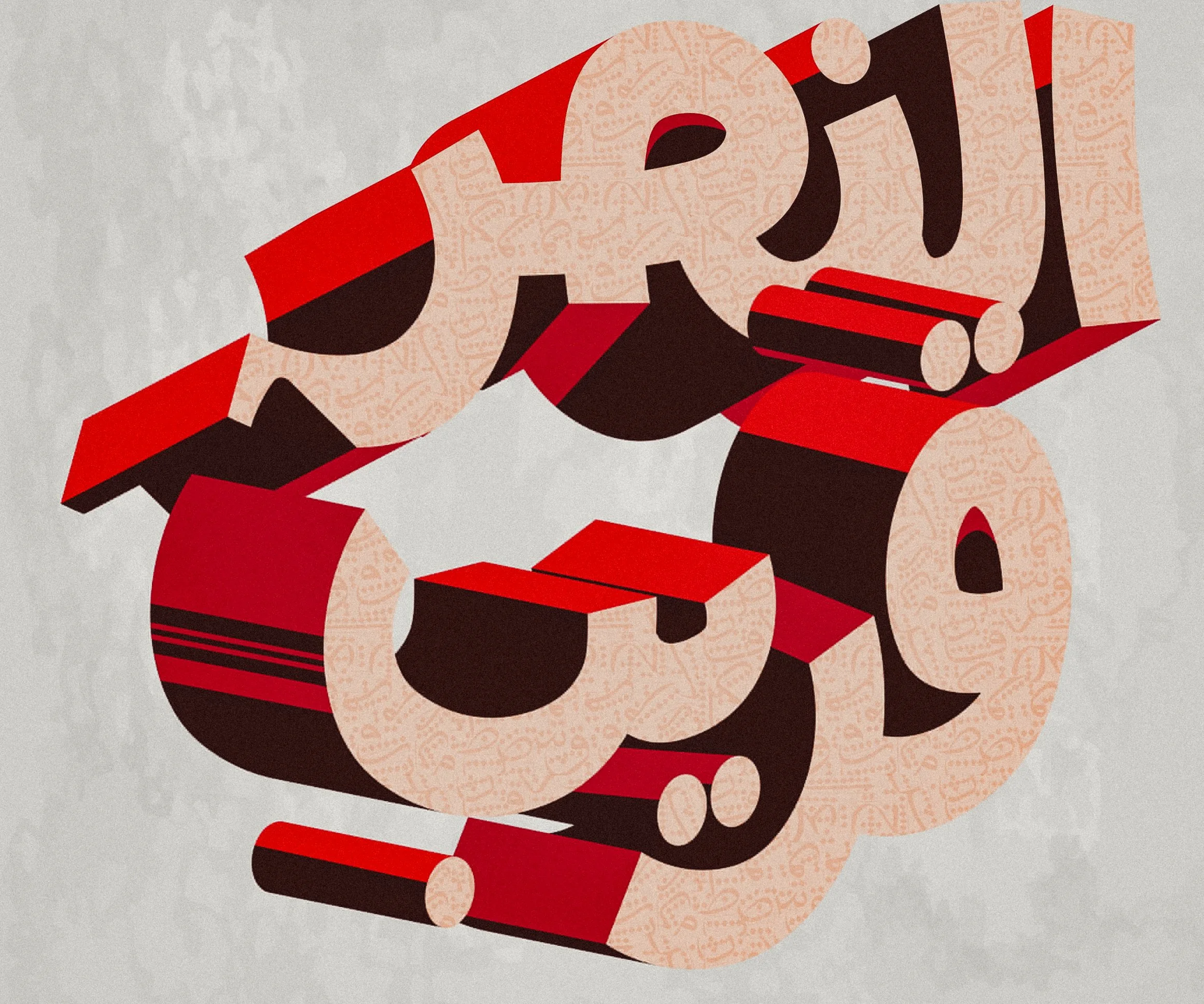
Below are type and design specimen I found while researching, helping me understand my limits with legibility and narrow in on a branding style true to the country of morocco.

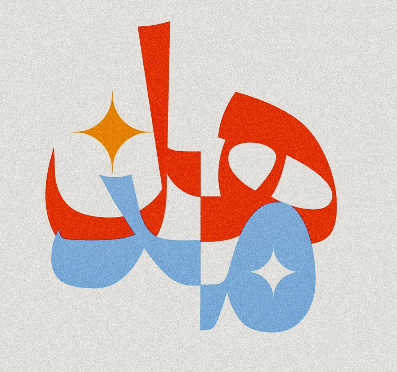
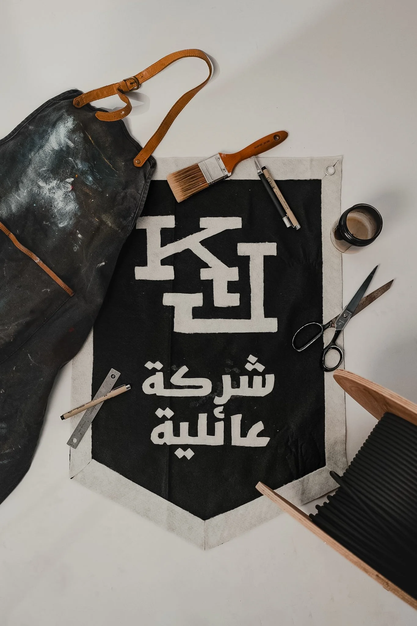
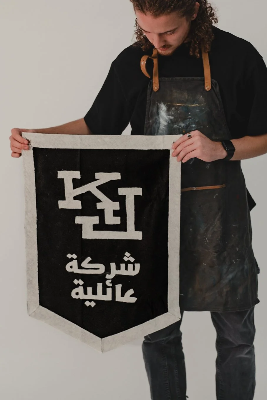
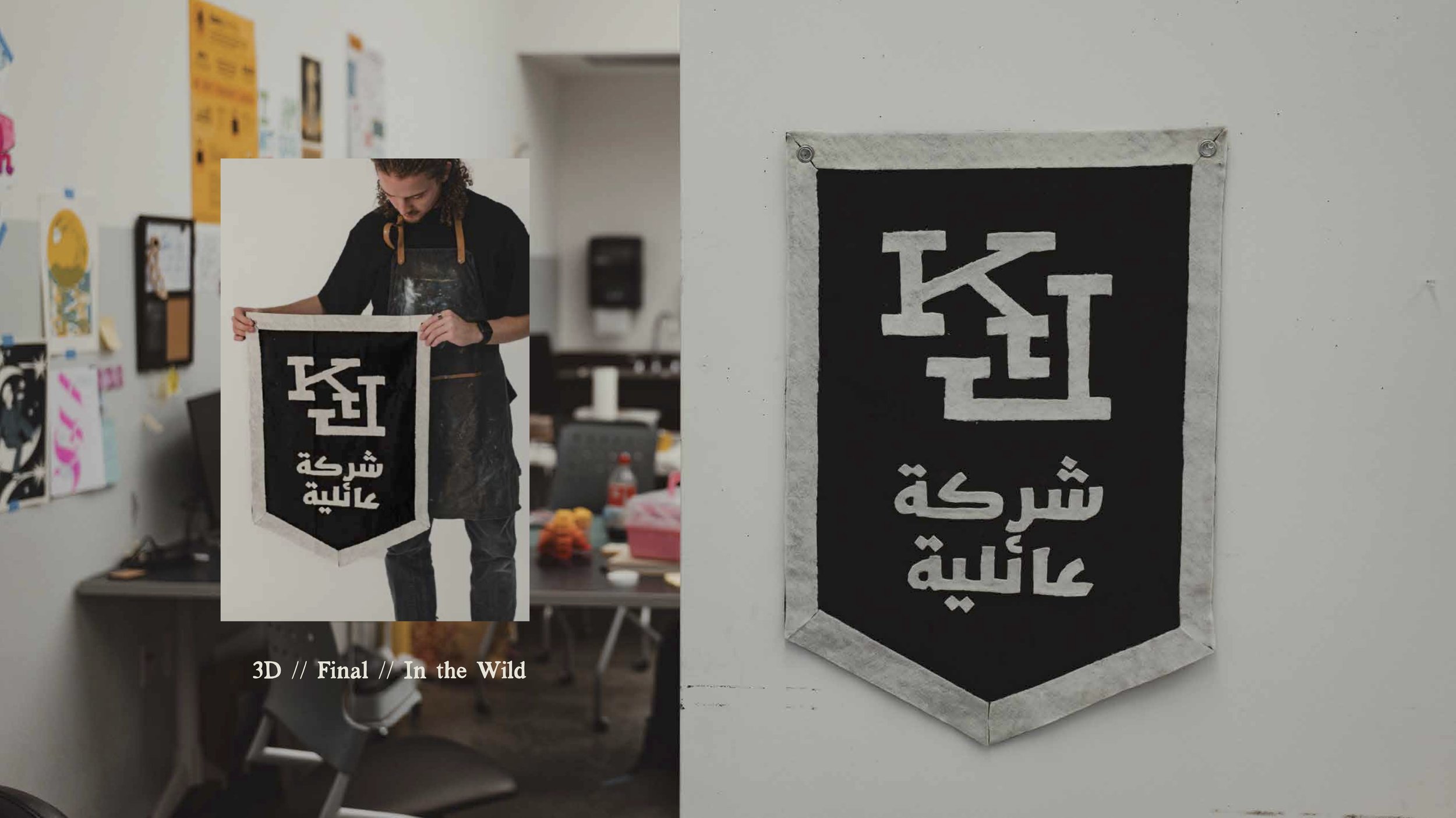
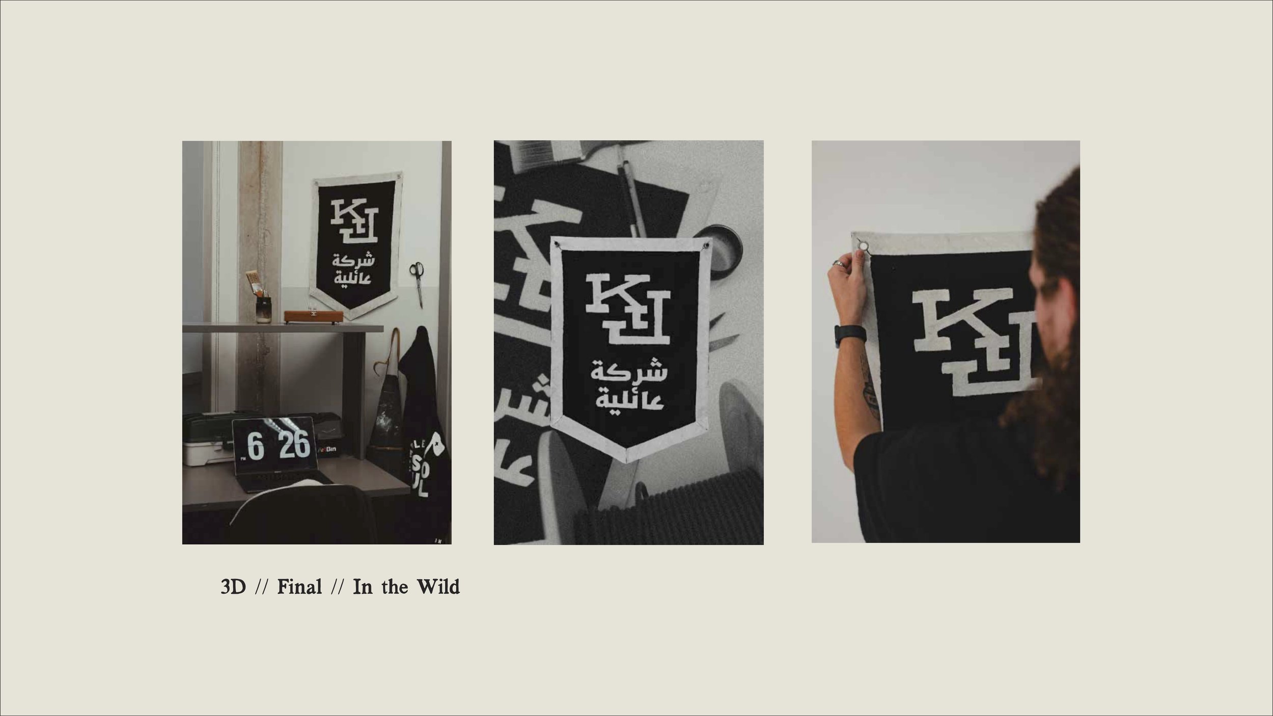
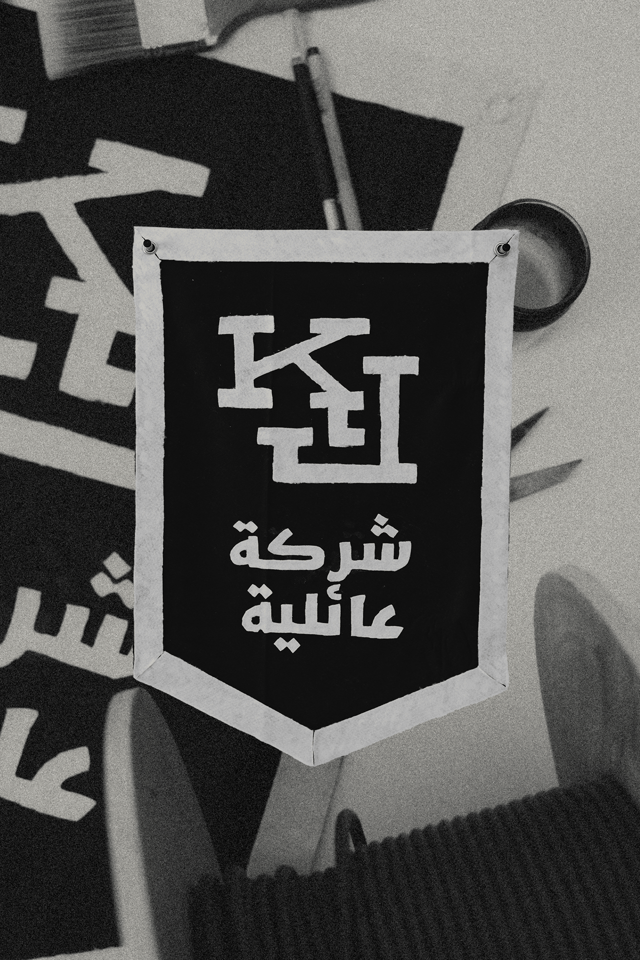
The Kindred pennant, ready for display in the studio.