Tokai
Brand Identity & Illustration Designer, May 2025
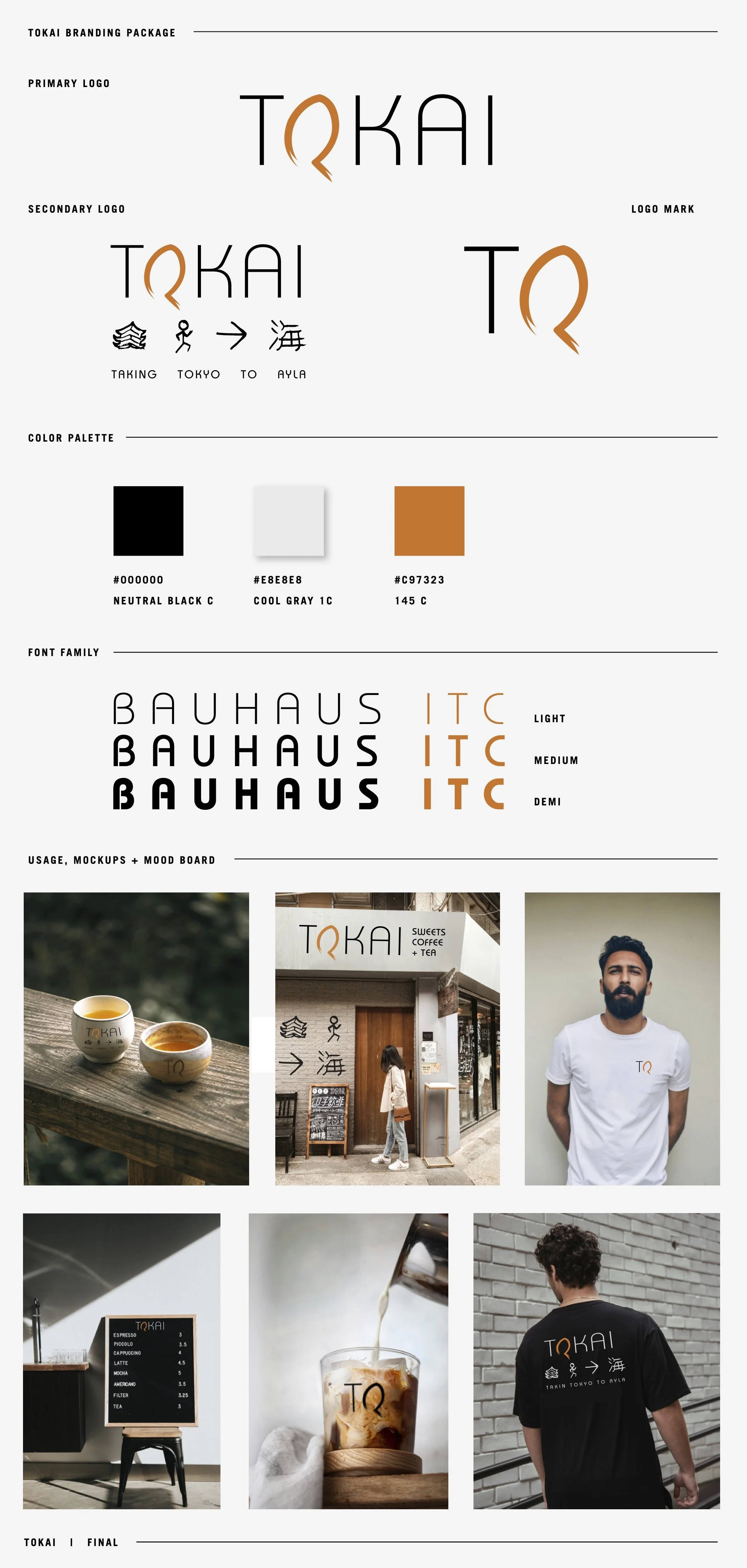
Tokai needed a refreshed identity as they grew from a small stand in Aqaba, Jordan, into a larger brick-and-mortar café. Formerly Tokyo Ayla, the brand needed to keep its original Japanese influence while becoming clearer, more flexible, and more memorable.
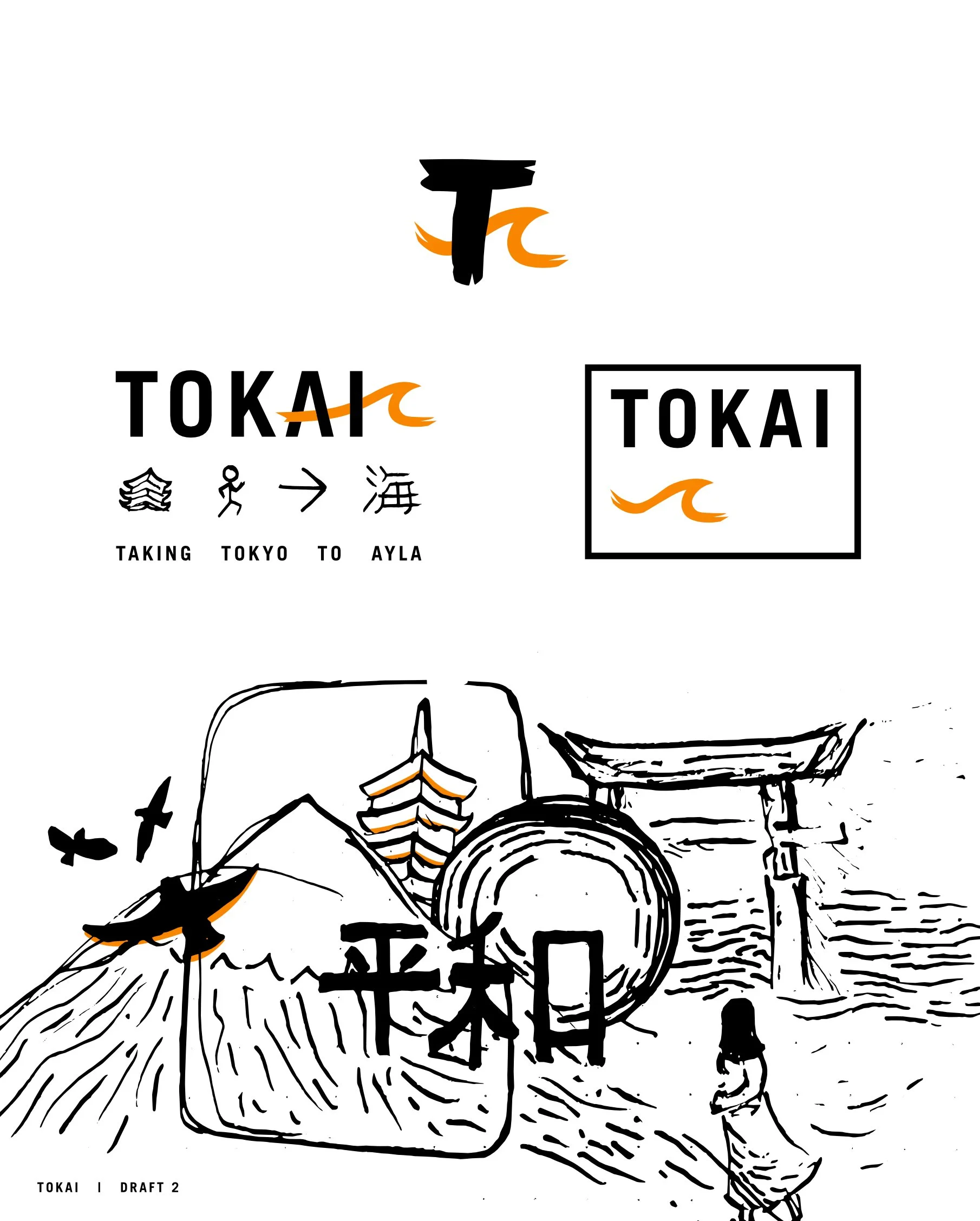
The name Tokai, meaning “to the sea,” connected the brand’s Japanese inspiration with Aqaba’s location on the Red Sea. Together we developed the slogan “Taking Tokyo to Ayla,” tying the old name to the new direction and capturing the idea of bringing Japanese food, coffee, desserts, and visual character to Aqaba.
What I Did & Why It Mattered:
Developed a refreshed identity that honored Tokyo Ayla while giving Tokai room to grow.
Created the slogan “Taking Tokyo to Ayla” to connect the brand’s story, location, and Japanese influence.
Built a flexible visual system for signage, social, packaging, and in-store touchpoints.
Designed custom illustrations that gave the brand a more distinct and memorable personality.
Balanced Japanese-inspired details with an approachable café identity for both local Arab audiences and international visitors.
The result was a warm, character-rich brand system that helped Tokai enter its next stage with a clearer identity, stronger visual presence, and a story rooted in both Tokyo and Aqaba.
CHECK OUT THE IDENTITY IN ACTION BELOW
CLICK HERE TO VIEW THE TOKAI INSTAGRAM LIVE